
What's on our mind.
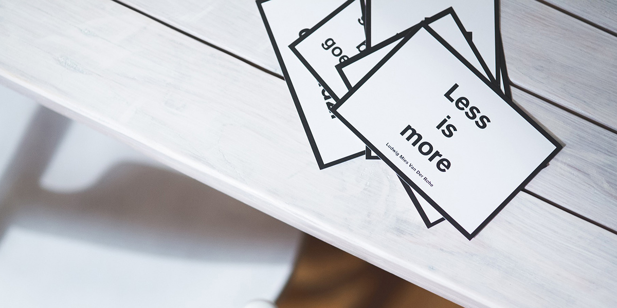
Less is More
Believe it or not, we are all designers to some regard; we chose our clothing, our home decor, our vehicle, and the list goes on. Sure you may have not designed these items I've mentioned, but you formulate an opinion and make your decision for the most part (of course there are other factors involved irrelevant to the point I am trying to make), based on the way they look. Now it's important to understand that people will have different opinions when it comes to design; I want to make it clear that this is my opinion and it's not right or wrong, but simply the direction I believe design is headed and why it should be considered.
The title of this blog entry is less is more for a reason. I have always liked concepts such as simple designs, solid colours or shades, or typography. Over the last five years, I can honestly say I've seen it all when it comes to digital design. I've tried my best to steer clients into the direction which I believed was the best for them and other times I've compromised in order to ensure that the end result was in accordance to what was expected.
I think the easiest way to present what's on my mind would be to create an example. Let's pretend we were starting a company together called XYZ Landscaping. When you think of landscaping, naturally you think of trees, grass, lockstone, gardening, yard maintenance, etc. Now does our company need to include all of this in our logo in order for people to understand what we do? Of course not, we already have lanscaping in our name. Why not use clean typography and perhaps even some sort of emblem with a piece of equipment or a tree. Then we can develop business cards, a brochure, and/or a website that identifies all of the different services we plan on providing. It's a simple example, but the truth is that having a tree, a shovel, a lawn mower, lockstone, the Sleeping Giant (I could probably write an article on that topic alone) or every colour in the rainbow in your logo is not going to add any extra value to your company. For starters, it's going to look disorganized and confusing; secondly, imagine trying to use that for print materials, on the side of your vehicle or embroidered on a shirt? It's just too much, and if you look at current trends or timeless designs, you'll notice they follow exactly what I am mentioning.
I'll close by saying again that it's just a matter of opinion and some might say it's less exciting or maybe even boring. Many of you are probably familiar with various design or idea inspiration websites such as Pinterest, Esty, or Houzz. Well one of my favourites is Awwwards (a user based website where people can vote on digital designs) and ironically while I was writing this article I stumbled across an article that identifies 99 of the most inspiring and creative logos of the past few years. It was refreshing to see that I certainly am not alone when it comes to my approach to design; you can click here to view the article. Hopefully, this has shed some light into the world of graphic design and is something that can be helpful for your next project. We'll chat soon.
*Before people get upset, I just want to say that I respect the Sleeping Giant, but I don't think it has to be included in everything that has to do with Thunder Bay. Give the persian some love too!